
Icon Customization
Overview
DisplayNet Manager provides comprehensive icon and color customization capabilities using a shared library of over 7,000 professional Material Design Icons. This system allows you to personalize the visual appearance of devices, scripts, and snapshots throughout the DisplayNet platform.
Customized icons appear in DisplayNet Manager in the following places:
- Routing views and matrices
- Device Settings for individual devices
- Preset Library including Scripts and Snapshots
- Tagging and organization features
The same customized icons automatically appear in DisplayNet Controller in:
- Routing and Preset interfaces
What You Can Customize
The icon customization system allows you to personalize:
- Device Icons: Visual representation of transmitters and receivers
- Script Icons: Custom visual identifiers for automation scripts
- Snapshot Icons: Visual identifiers for saved system configurations
All icon selections are automatically synchronized between DisplayNet Manager and DisplayNet Controller, ensuring consistent visual representation across both applications.
System Architecture
Shared Icon Library
The system uses Material Design Icons (MDI) as the foundation, providing:
- Professional Quality: Over 7,000 carefully designed icons
- Consistent Style: Unified visual language across all icons
- Scalable Format: SVG-based icons that scale to any size
- Color Flexibility: Dynamic color modification for any hex color
- Performance: Intelligent caching and memory management
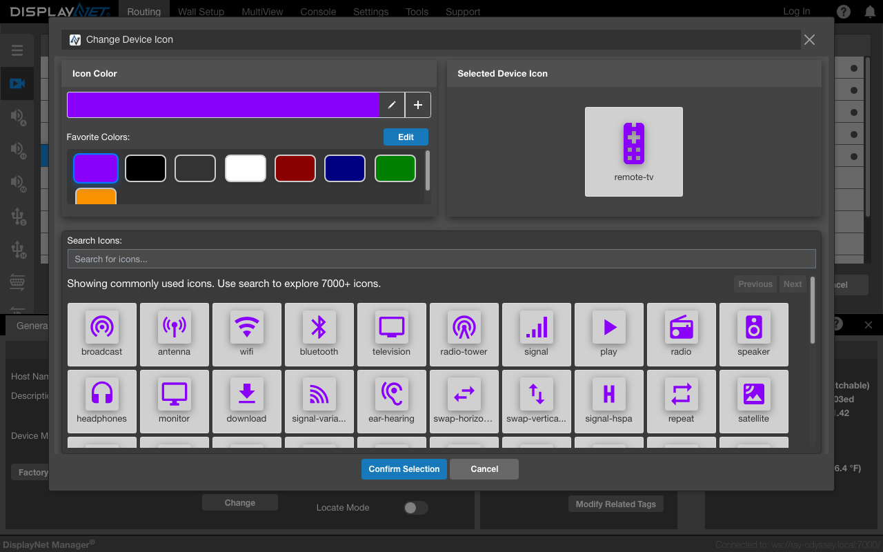
The icon selection modal showing the Material Design Icons library with color customization, favorite colors, search functionality, and the grid of available icons. This interface allows users to select and customize icons for devices, scripts, and snapshots.
Cross-Application Integration
Icon selections made in DisplayNet Manager automatically appear in DisplayNet Controller:
- Selection: User customizes icons and colors in DisplayNet Manager
- Storage: Choices saved to system configuration
- Synchronization: DisplayNet Controller reads the same configuration
- Display: Icons appear consistently in routing views and thumbnails
Icon Selection Interface
Opening the Icon Selection Modal
The icon selection interface is accessed through different methods depending on the context:
- Device Settings: General tab → Device Icon section → "Change" button
- Script Management: Preset Library → Script Editor → Edit icon button in the top toolbar
- Snapshot Management: Preset Library → Snapshot Viewer → Edit icon button in the top toolbar
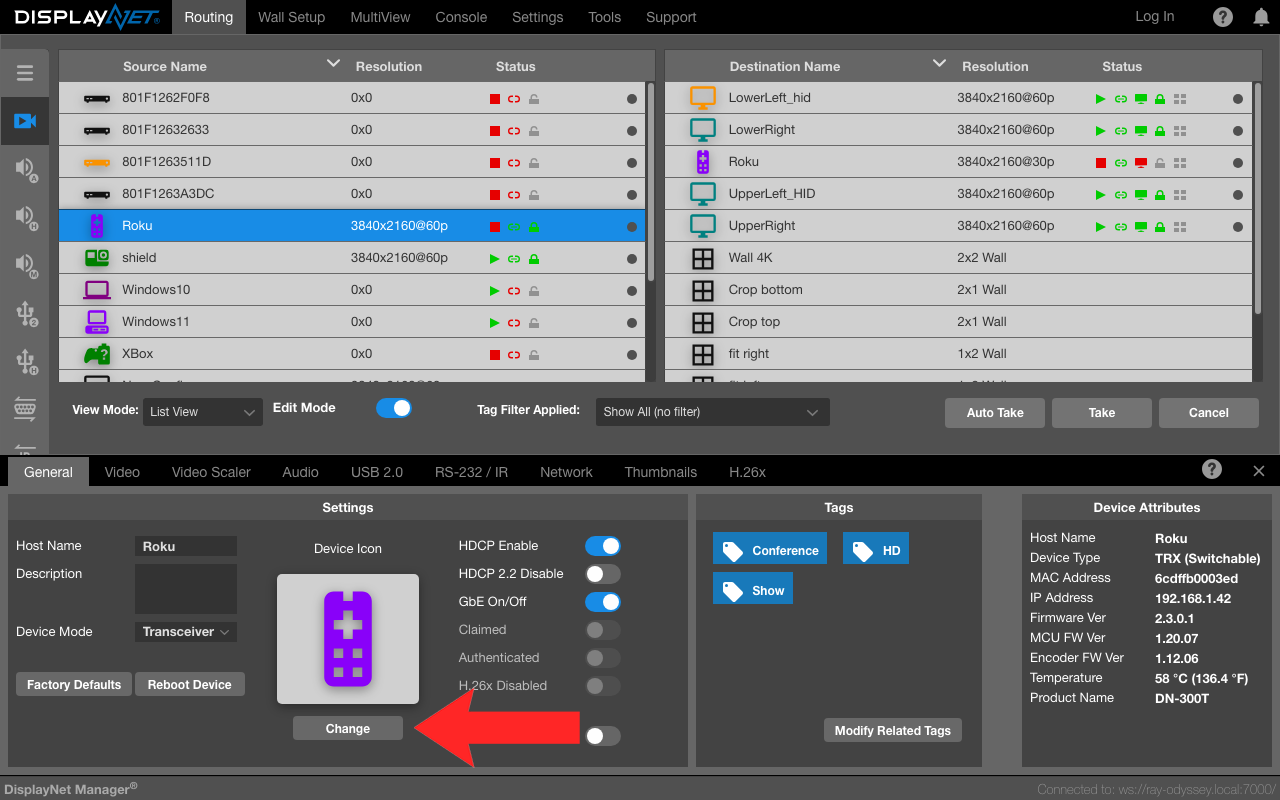
For Devices: The "Change" button location in Device Settings (General tab → Device Icon section) that opens the icon selection modal for customizing device icons.
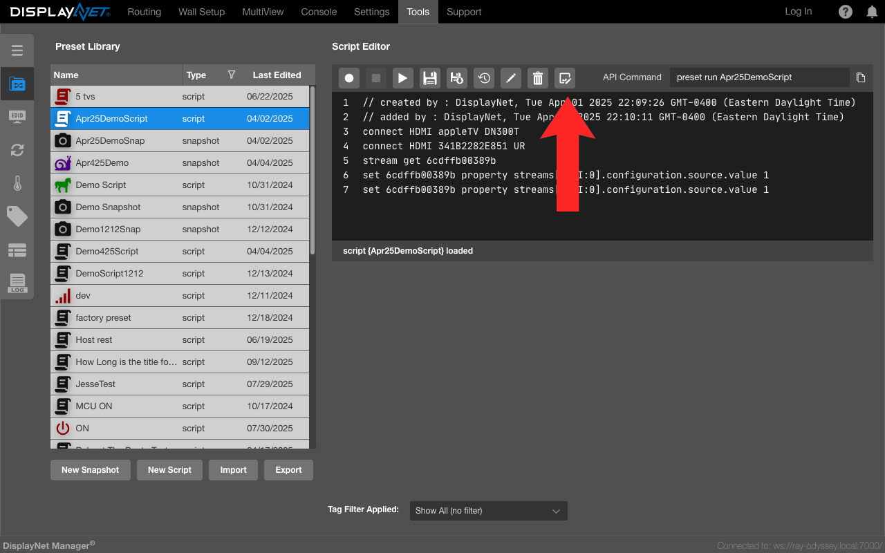
For Scripts: The edit icon button located in the Script Editor top toolbar that allows customization of script icons in the Preset Library.
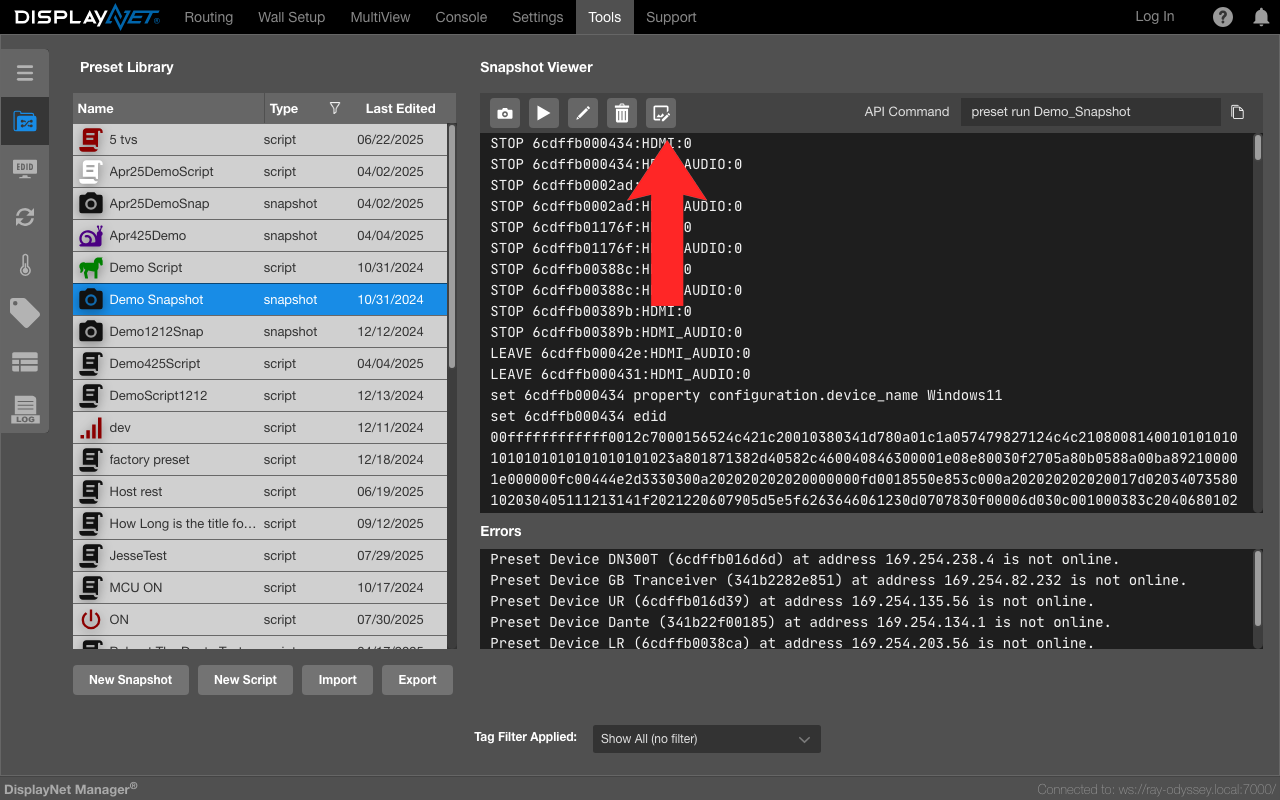
For Snapshots: The edit icon button located in the Snapshot Viewer top toolbar that enables customization of snapshot icons in the Preset Library.
Modal Interface Layout
The icon selection modal provides a comprehensive interface with several key sections:
Icon Color Selection
The color selection area includes:
- Color Display: Shows the currently selected color
- Color Picker: Standard HTML5 color picker for custom colors
- Favorite Colors: Quick access to frequently used colors
- Add to Favorites: Button to save current color to favorites
The following screenshots demonstrate the key interactive elements within the color selection area and how to use them:
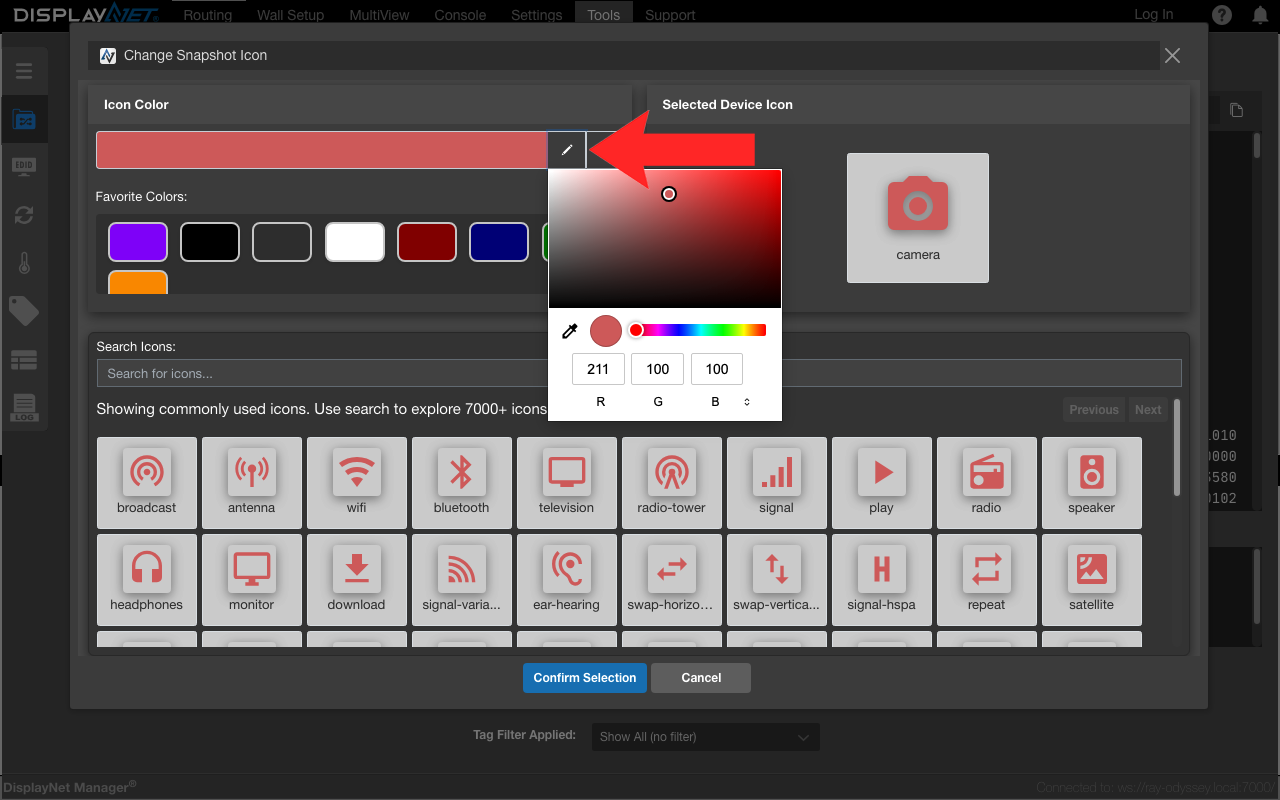
Screenshot showing the color selection section with an indicator pointing at the color selection pencil icon for customizing icon colors.
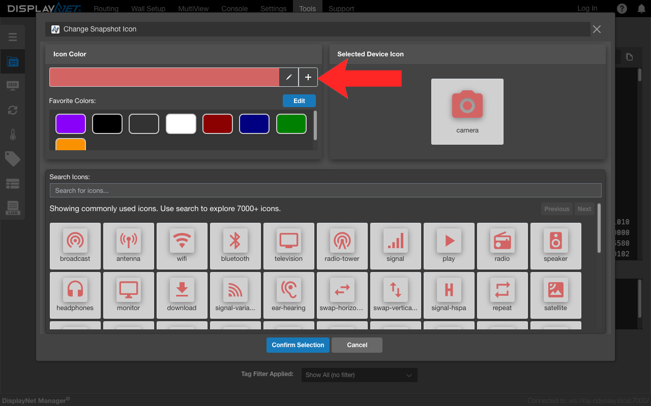
Screenshot showing an indicator pointing at the 'Add to Favorites' button that allows users to save the currently selected color to their favorite colors palette.
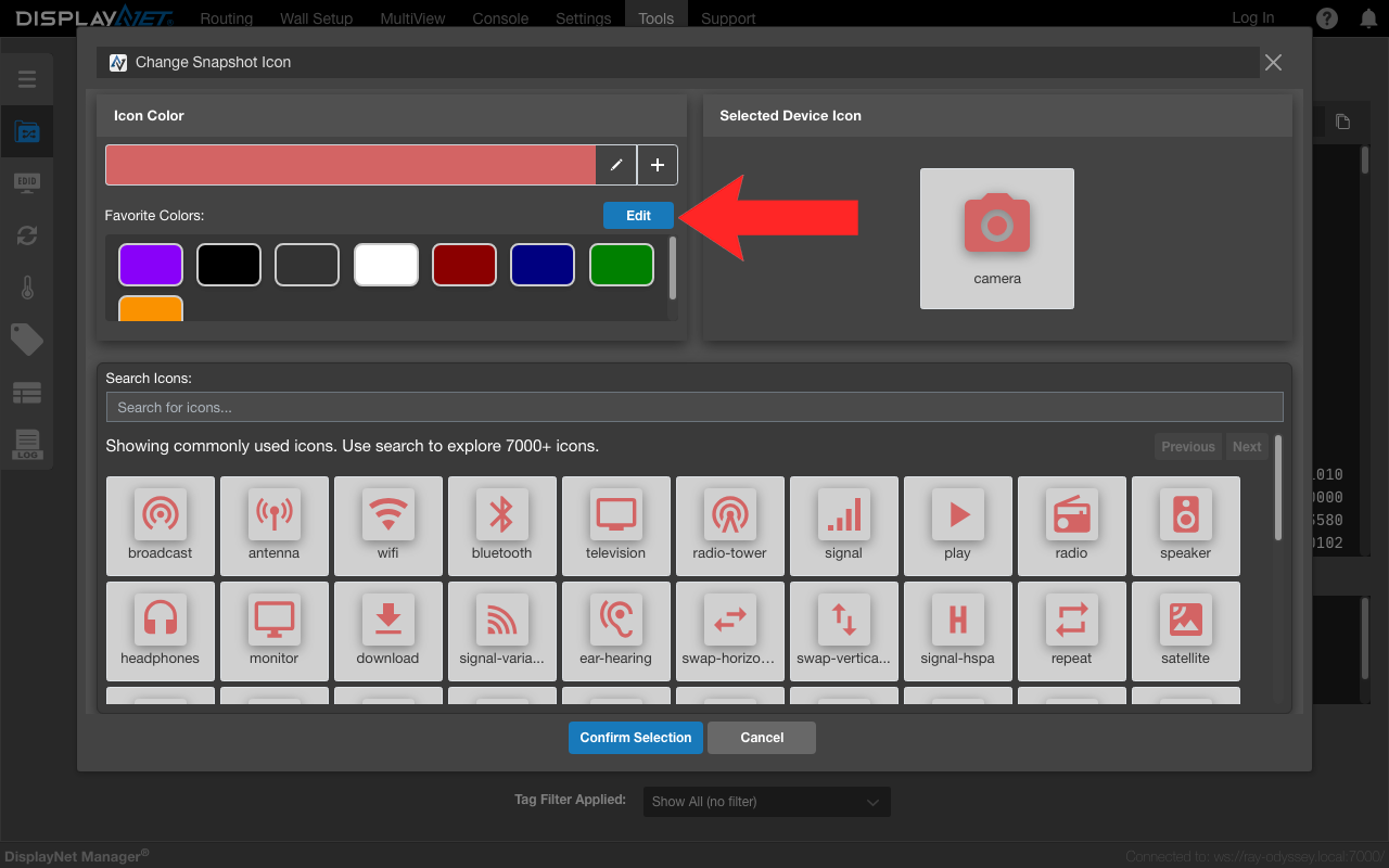
Screenshot showing the Edit button for favorite colors. Click this button to enter edit mode, which displays delete (X) buttons on each saved color. Click a delete button to remove that color from favorites. Click the Edit button again to exit edit mode.
Icon Browser
The icon browser provides:
- Search Field: Type keywords to find relevant icons
- Icon Grid: Visual grid displaying available icons
- Live Preview: Selected icons update with chosen color in real-time
- Pagination: Navigate through large icon collections
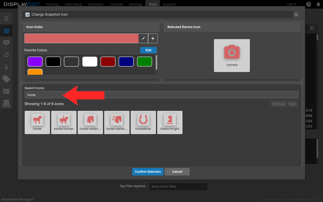
Screenshot showing search results for "horse" in the icon browser. Notice how the search is intelligent - when you search for "horse", it not only shows icons with "horse" in the name, but also searches through icon metadata and tags. For example, a chess knight piece appears in the results because it's associated with horses in the icon's metadata, making it easier to find related icons even when they have different names.
Using the Icon Selection System
Selecting an Icon
- Open Selection Modal: Access the icon selection interface using one of the methods shown in the screenshots above (device "Change" button, script editor icon button, or snapshot viewer icon button)
- Choose Color:
- Click the color picker to select a custom color
- Or click a favorite color for quick selection
- Browse Icons:
- Use the search field to find specific icons (e.g., "camera", "monitor", "wifi")
- Browse the grid to see available options
- Preview Selection: Selected icon appears with chosen color
- Confirm Choice: Click "Save" or "Apply" to confirm selection
When no search is performed, the system displays a curated subset of approximately 60 commonly used icons as examples and placeholders. Since there are over 7,000 icons available in the complete library, this default selection makes it easier to browse without being overwhelmed. Users can either select from these default icons or use the search functionality to find specific icons from the full collection.
Search Tips
Effective search terms include:
- Device Types: "monitor", "camera", "speaker", "projector"
- Functions: "power", "settings", "network", "signal"
- Concepts: "video", "audio", "wireless", "remote"
- Actions: "play", "record", "sync", "connect"
The search system matches icon names, aliases, and tags for comprehensive results.
Color Management
Color Picker
The color picker supports:
- Hex Values: Direct entry of hex color codes (e.g., #FF5733)
- Visual Selection: Click-and-drag color picker interface
- Real-time Preview: See color changes immediately on selected icon
Favorite Colors
The favorite colors system provides:
- Quick Access: One-click selection of frequently used colors
- Persistent Storage: Favorite colors saved across sessions
- Custom Management: Add new favorites or remove unused ones
- Default Palette: Pre-configured colors for new users
Where Icons Appear
DisplayNet Manager
Customized icons appear in:
- Routing Views: Device icons appear in both list and matrix display modes
- Device Details: Individual device pages display chosen icons
- Script Library: Custom script icons in automation section
- Snapshot Gallery: Personalized snapshot icons in saved states
DisplayNet Controller
The same icons automatically appear in:
- Routing Views: Device icons in routing matrices
- Thumbnail Displays: Small device representations
- Preset Views: Script and snapshot icons in preset interfaces
Best Practices
Icon Selection Guidelines
- Choose Recognizable Icons: Select icons that clearly represent the device or function
- Maintain Consistency: Use similar icon styles for related devices
- Consider Context: Choose icons appropriate for the device's role
- Test Visibility: Ensure icons are clear at both large and small sizes
Color Recommendations
- High Contrast: Choose colors that stand out against backgrounds
- Accessibility: Consider color-blind users when selecting colors
- Practical Colors: Avoid very light colors that may be hard to see
Icon changes affect all users on the DisplayNet system using DisplayNet Manager or DisplayNet Controller, as icons are tied to devices and presets rather than individual user accounts.